2

Delivery 005

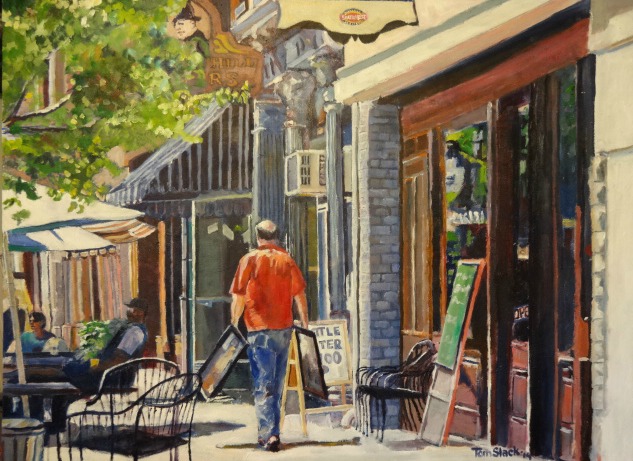
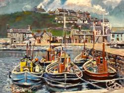
My  wife wanted me to paint this. She says it is the story of our life for the past sixteen years — painting, dropping off to galleries, shows, etc. There is depth in the picture because of atmospheric and linear perspective. The atmospheric perspective has things that are closer to the front painted over the top of items further back. Linear perspective shows the doorways and building filling the whole space on the right, but getting smaller as they move to the left.

3

amsterdam 004

I remember how surprised I was the first time I visited Amsterdam. Instead of roads, I found canals. Most people rode bicycles. They’d park them next to the canals. People would try to park their cars along side them. I was worried we’d drive right off into the water. I was intrigued by a small car I saw throughout Europe — “Smart” was the brand. It was tiny, but would fit in very small spaces.

This painting shows linear perspective — the water is wider in the front of the painting than in the rear. This gives depth to the picture. Another technique used is complementary colors — red and green, which gives contrast and interest to the painting.

3

Gondolas 008

Venice is called by some “The Most Romantic City in the World.” Instead of regular streets, people travel by boats on the canals. I’ve tried to portray the glow of the sunlight on the water at twilight. The gondolas are backlit, so they appear as silhouettes. Shadows are blue. The city is in shadow. There is atmospheric perspective because the closest boat is larger than the smaller ones. The boats are sharply portrayed, but the city is not as distinct.

2

Tulips

This painting is a commission for someone who loves flowers. The red petals are complimentary to the green leaves and stems. Atmospheric perspective is used — larger flowers on top of smaller ones to give a feeling of depth. The stems are diagonal which give interest.

1

Rose Mallow 002

Another flower painting. These are from my own flower garden. I’ve tried to portray the direction each of the blossoms looks, as well as the sunlight shining on the leaves. The colors “pop” because I have used complementary colors — red and green. There is atmospheric perspective. It appears there is depth to the painting. This is done by painting the larger flowers on top of the smaller ones.

Oil on canvas, 16″x24″ $400.00.

2

Contemplation 001

Several years ago, my wife and I moved to Indiana. We didn’t know much about the state, so one day we went for a ride. I told her I wanted to go to Lake Michigan. She didn’t want to because it was too far. She was really glad when we got there. It was a little overcast and the temperature was mild. We walked up and down the beach,  just enjoying ourselves and forgetting our cares. This is my effort to portray what we were feeling on that day. Because it was overcast, I used muted colors. The water has many shades and values, so I used them. I love painting figures and I like the gesture of this one.

3

Morning Stretch 010

This painting is a commissoned work for a dental office. It is actually a scene from my own wildflower garden. Atmospheric perspective was used to give depth to the picture. Flowers were painted over the top of each other so it looks like the viewer is looking into the scene. Complementary colors were used  — red and green. There is a contrast between the dark background and the two top flowers which are light pink. This gives drama and interest.

6

Berries and Pineapple 001

Claude Monet loved to entertain friends and guests. He loved to have them eat dinner with him. He was very particular about the presentation of his meals. To him, it was art. I agree with him. My daughter, Jennifer, always presents her meals in such a beautiful manner. This painting portrays something she might do. There is depth in the painting because some things are painted in front of each other, and the closest ones appear larger.

24″x30″ oil on canvas.  $1500.00